Bloomie AI
.png)
11K+
Portfolios Created
~32%
Funded After Creation
$418K+
Investment Activity Enabled
Role
Tools
Team
Duration
Context
Investing rarely starts with a clear plan. More often, it starts with curiosity and a lot of uncertainty.
A new investor opens an app ready to begin, but quickly runs into thousands of stocks, unfamiliar terms, and very little sense of what actually matters. Some pause and do nothing. Others default to whatever they last saw on TikTok, the News, or Reddit, hoping it’s a good enough place to start.
This is the moment Bloomie was designed to support.
Bloomie is an AI research assistant designed to help users make sense of stocks, market signals, and investing ideas as they explore them. Instead of pushing recommendations, it adds context at the right moments, helping users move forward without overwhelming them or taking control away from them.
Problem Statement
Despite a strong interest in investing, many young adults feel like they are guessing what to invest in.
The issue isn’t a lack of information. It’s the gap between seeing options and understanding them. Users are shown stocks, cryptocurrencies, and ETFs (exchange-traded funds), but rarely understand why certain companies are grouped together, which signals are worth paying attention to, or how research should translate into an actual decision.
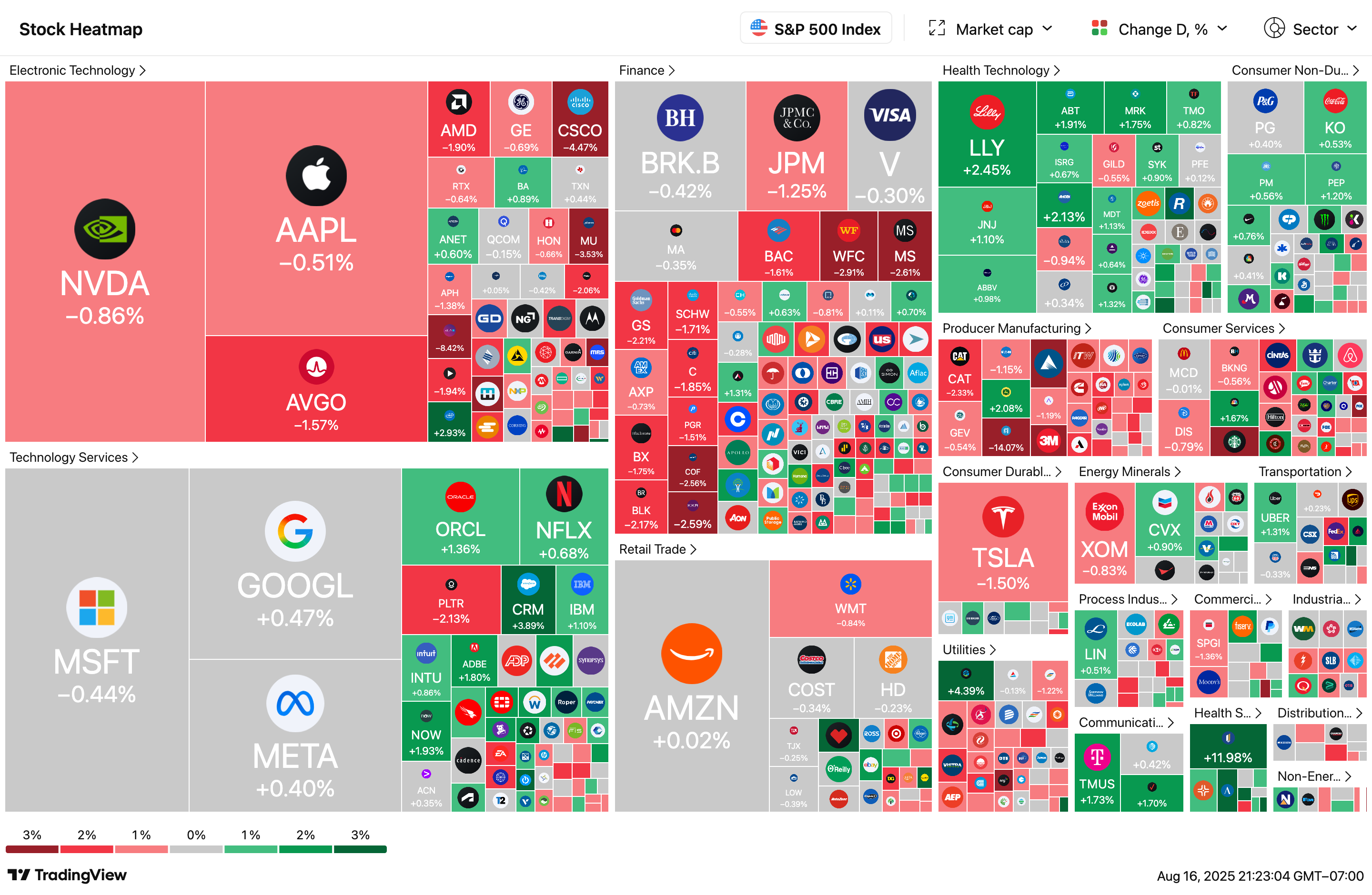
Each square represents a single stock. For someone new to investing, that’s already a lot to process.
And that’s just one index. Zoom out, and you’re faced with thousands of publicly traded stocks across U.S. markets, plus ETFs and crypto layered on top. The challenge isn’t access. It’s knowing where to start and what actually matters.
What I Learned From Users
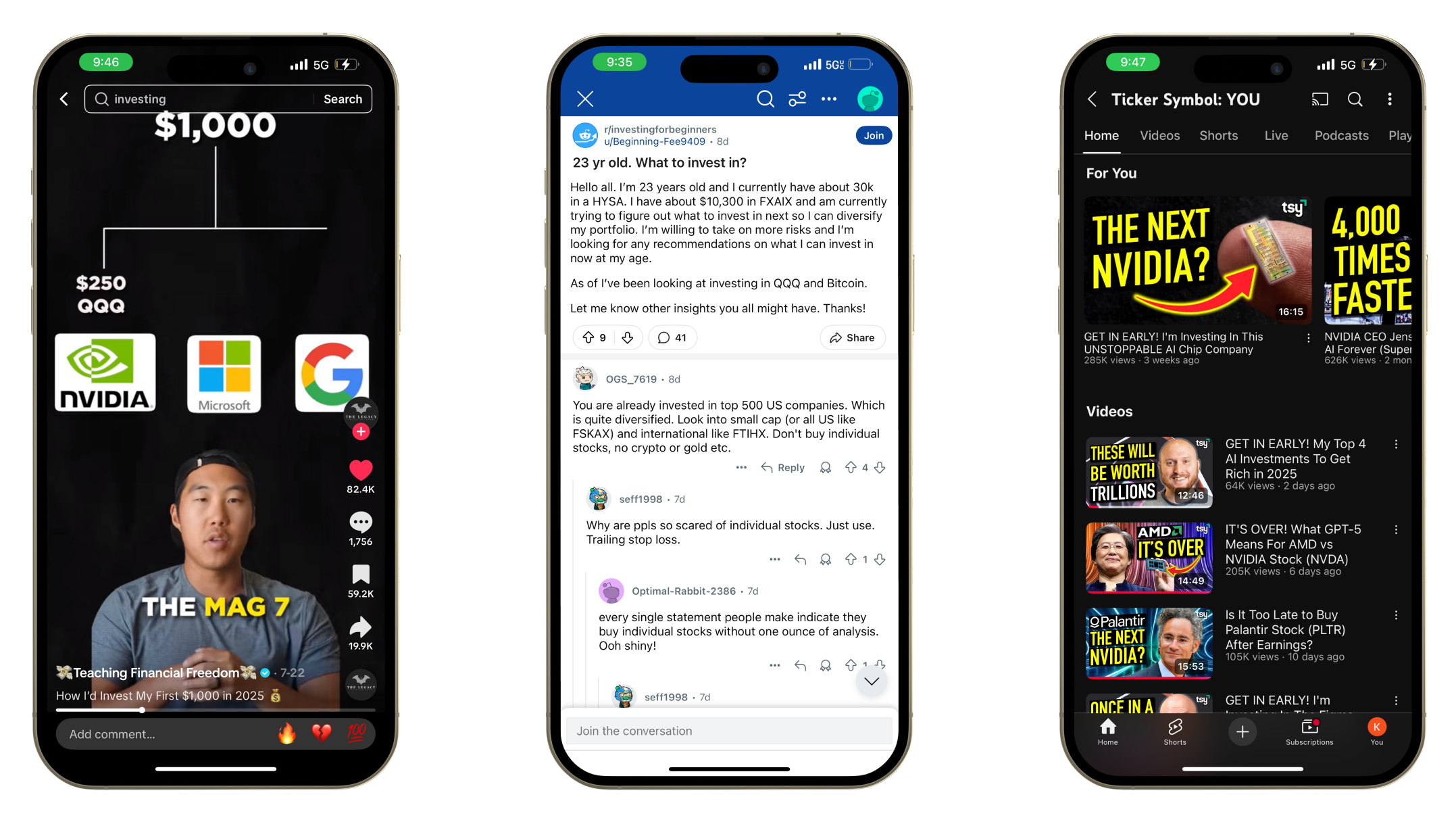
Talking to new investors revealed a clear pattern. People weren’t afraid of investing. They were afraid of not understanding what they were doing.
Many turned to social media for ideas, not because they trusted it more, but because it explained things in a way that felt approachable. Short explanations, clear narratives, and visible reasoning mattered more than technical depth.
When users tried AI tools, they disengaged quickly if responses felt generic, overly long, or disconnected from what they were actually looking at in the app. At the same time, they were clear about one thing. They didn’t want an AI that made decisions for them. They wanted help thinking, not instructions.
The opportunity wasn’t to replace research or judgment. It was to guide both.
Research
Research Overview
- Interviewed users about how they currently make investing decisions. Many admitted to relying on social media hype.
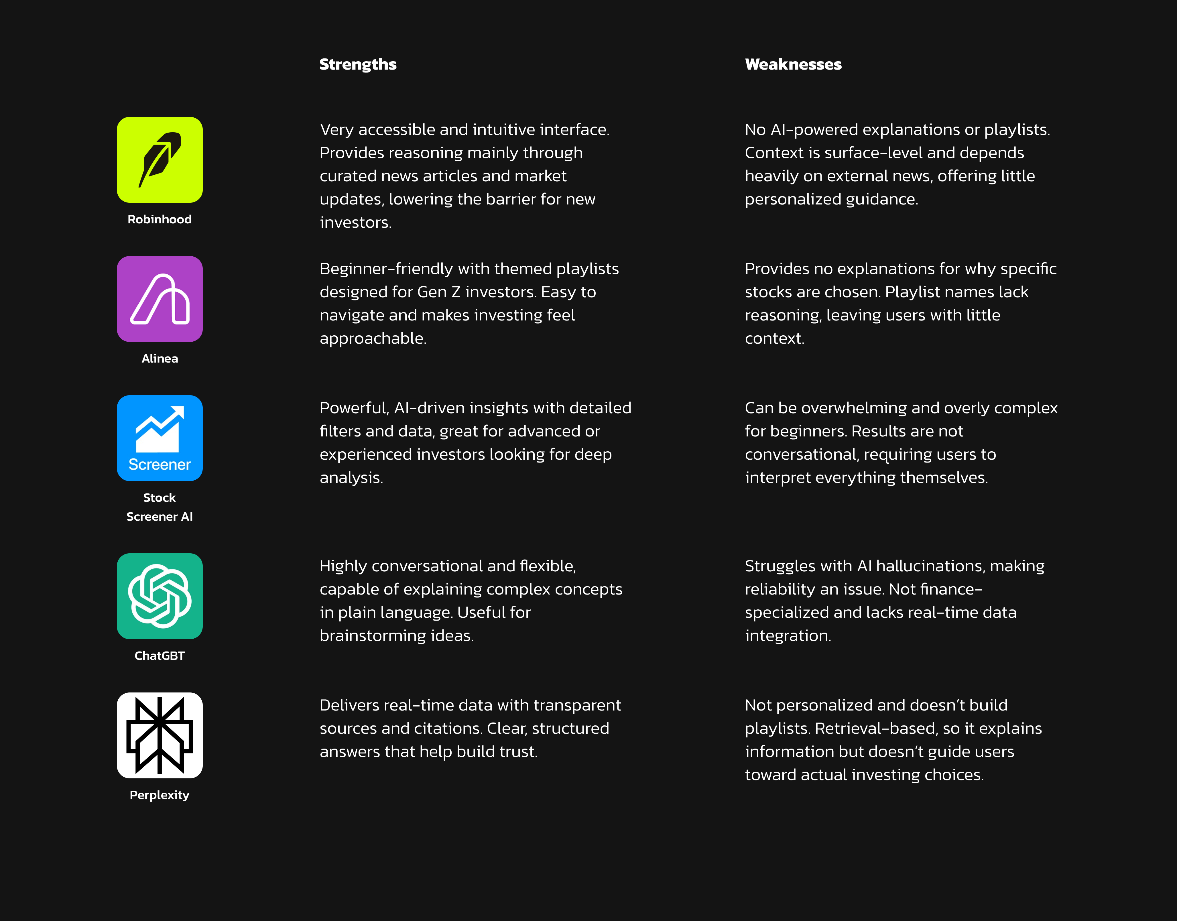
Benchmarked competitors like Robinhood, Alinea, Stock Screener, ChatGPT, and Perplexity. Each had strengths but also key gaps.
We ran feedback sessions on early AI explorations, where users shared how they approached stock decisions and what felt confusing or useful.
Why Existing Tools Fell Short for New Investors
To understand where Bloom could add value, I looked at how existing investing platforms and AI tools supported decision-making.
Some tools prioritized simplicity, offering clean interfaces and curated content that lowered the barrier to entry. Others focused on depth, providing powerful data and filters for experienced investors. AI tools added flexibility and explanation, but often struggled with reliability, relevance, or translating insight into action.
Across these products, a pattern emerged. Users were either given what to look at, or how to analyze it, but rarely both at the same time.
This gap shaped Bloomie’s direction.
Ideation
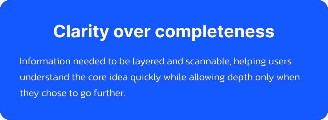
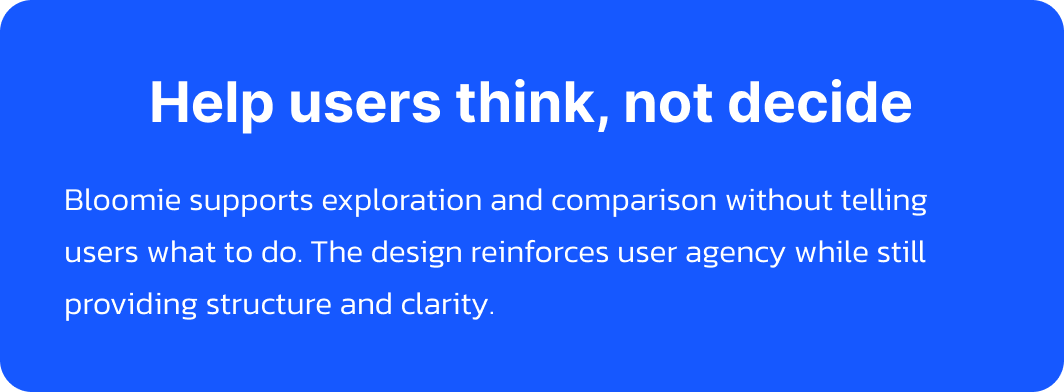
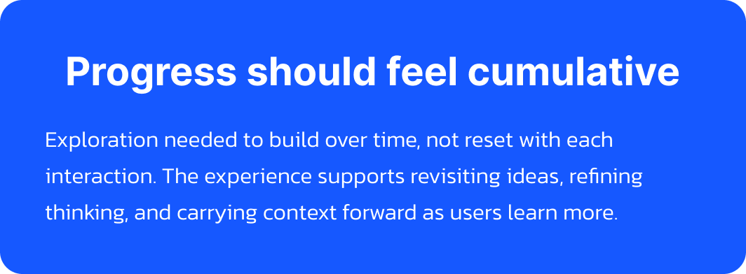
Design Constraints
.png)
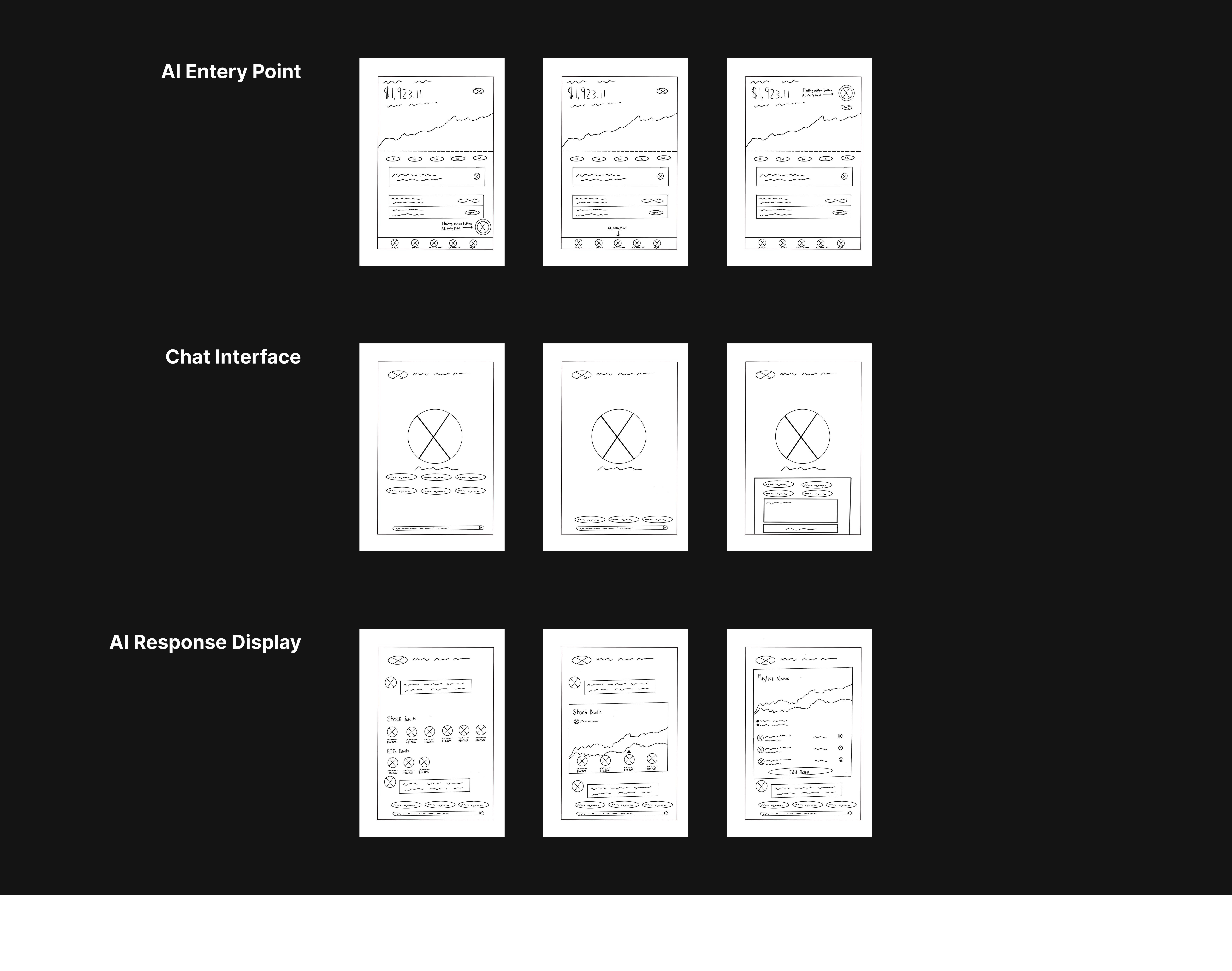
Sketches
Early sketches helped us figure out how Bloomie should actually show up inside the product before committing to higher-fidelity designs.
They let us explore different entry points, conversation patterns, and moments where explanation mattered most, while aligning with engineering early and refining the experience before moving forward.
From Prompts → Intent Driven Modes
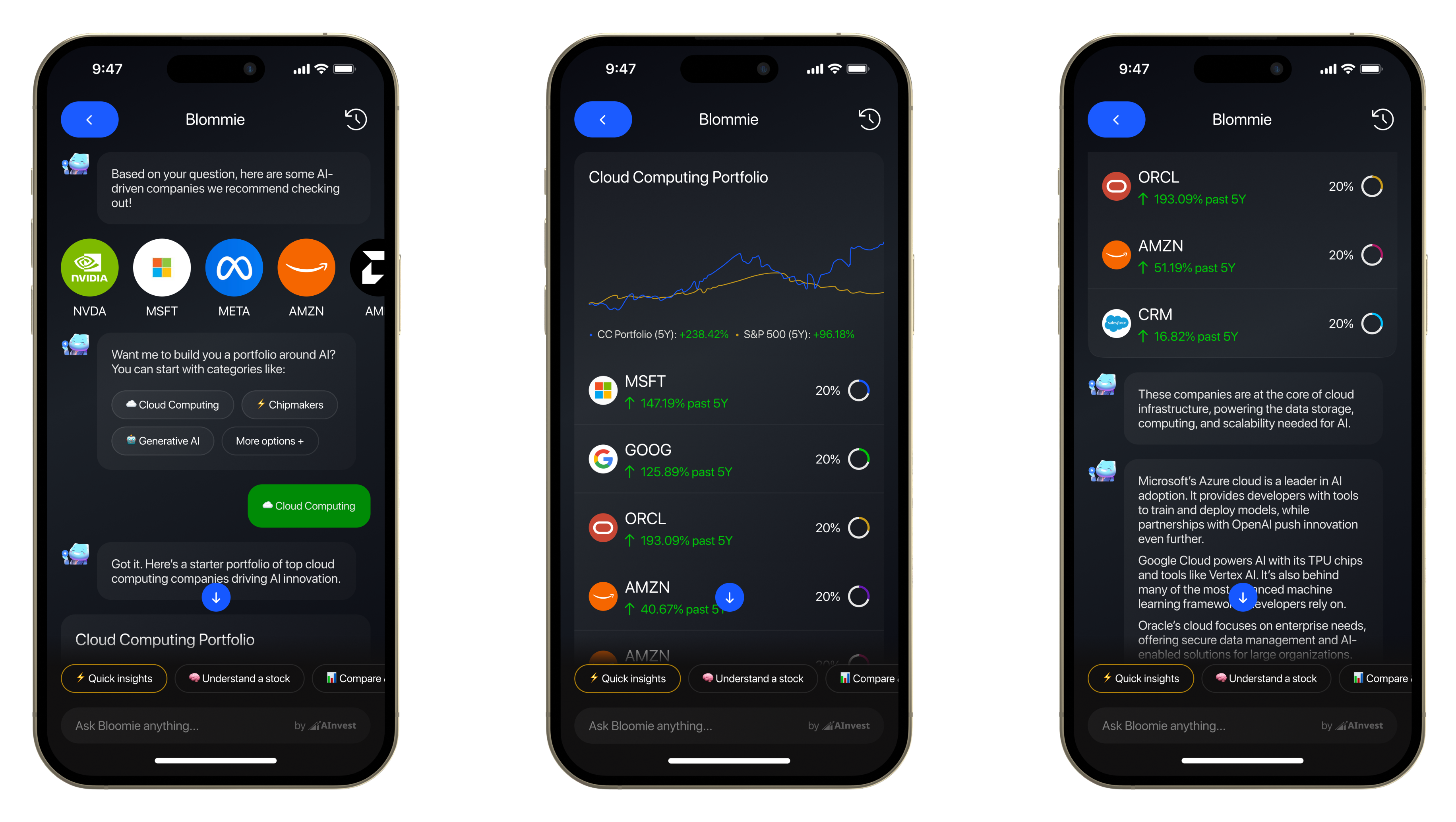
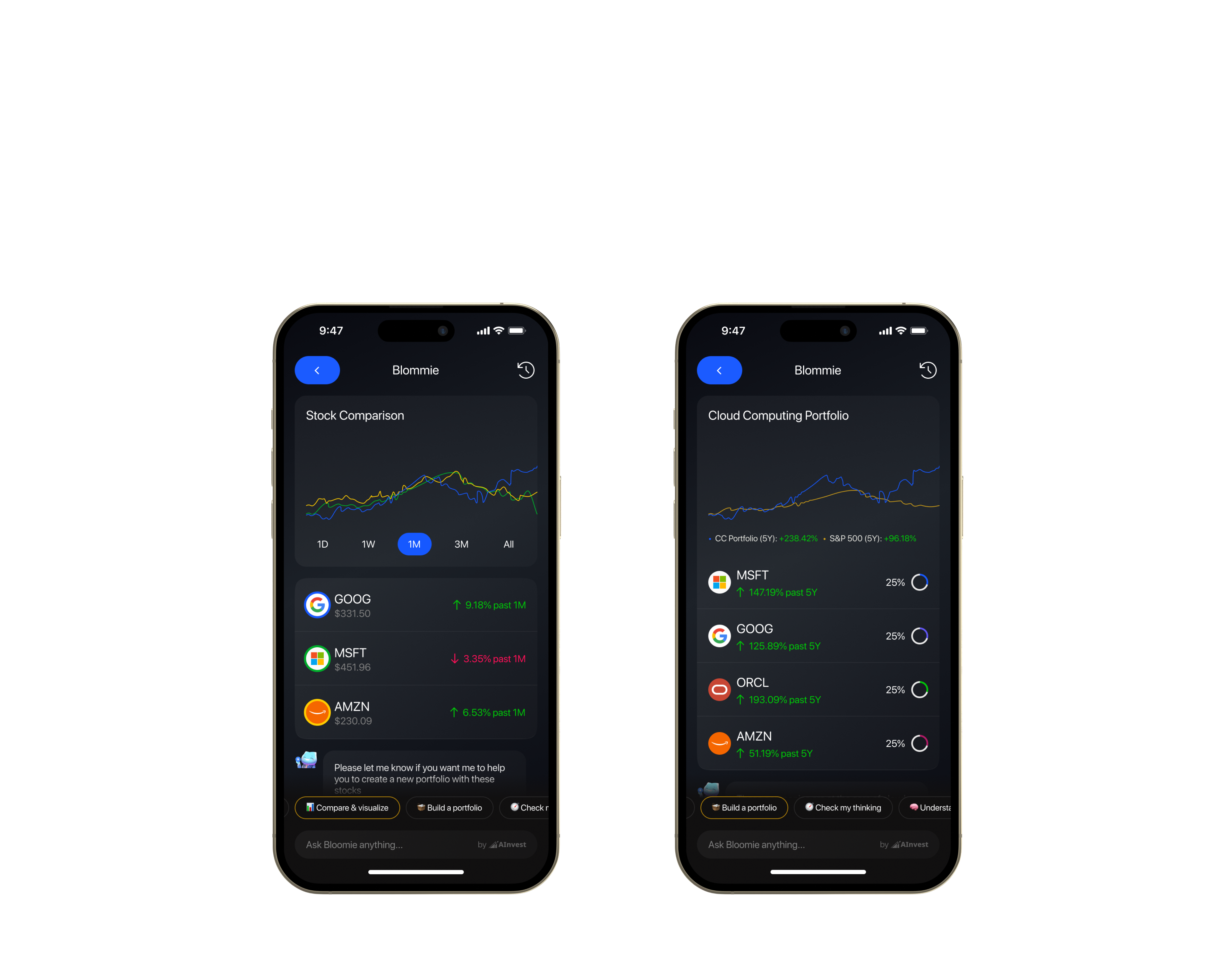
At launch, Bloomie relied on guided prompts to help users get started. This worked well for onboarding, but over time I noticed a limitation. Very different goals were being treated the same way.
A user researching a single stock, comparing performance between companies, building a portfolio, or trying to make sense of recent market news was asking fundamentally different questions. But Bloomie responded with the same structure, tone, and depth each time.
Instead of expanding the prompt list, we rethought how Bloomie understood intent. We introduced distinct modes that users could intentionally switch between, shaping how Bloomie generated questions, explanations, and next steps based on what they were trying to do.
In practice, Bloomie behaved differently depending on context. Research-focused interactions prioritized explanation and sources. Comparison-driven interactions emphasized stock performance, trends, and visual graph comparisons. Portfolio-building interactions focused on tradeoffs and composition, while exploratory interactions stayed lightweight and open-ended.
This shift made Bloomie feel less like a chatbot and more like a tool that adapted to the user’s goal in the moment.
.png)
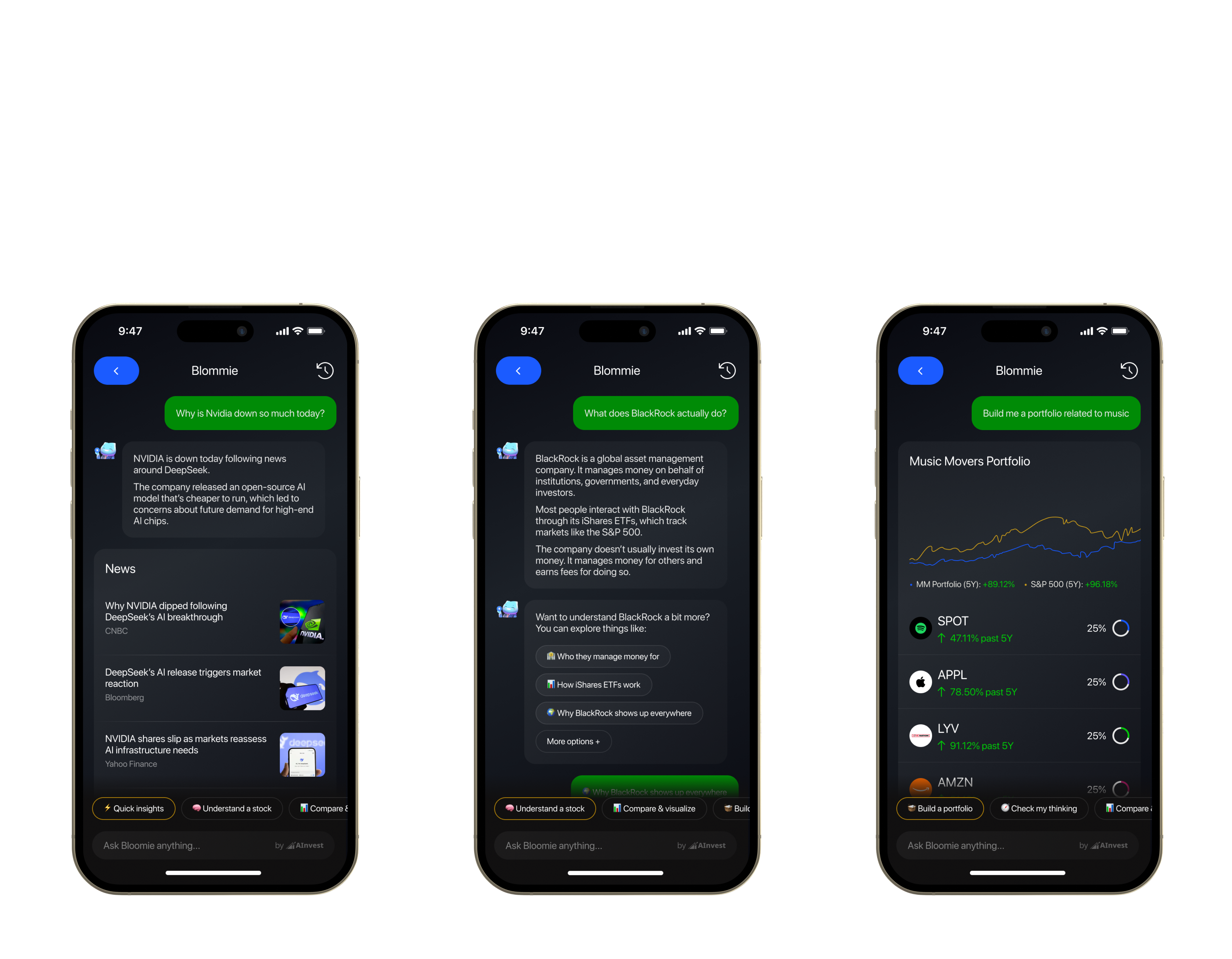
From One-off Answers → Ongoing Context
As usage grew, I noticed that many users treated Bloomie as an ongoing research companion rather than a one off interaction.
Users wanted to revisit past questions, track how their thinking evolved, and pick up where they left off. Without a sense of history, Bloomie felt disposable, even when the insights weren’t.
We introduced conversation history so users could return to previous threads, reference earlier research, and continue exploring ideas without starting over. This shift helped Bloomie feel more dependable and reinforced its role as a research tool users could come back to, not just a one time source of answers.
.png)
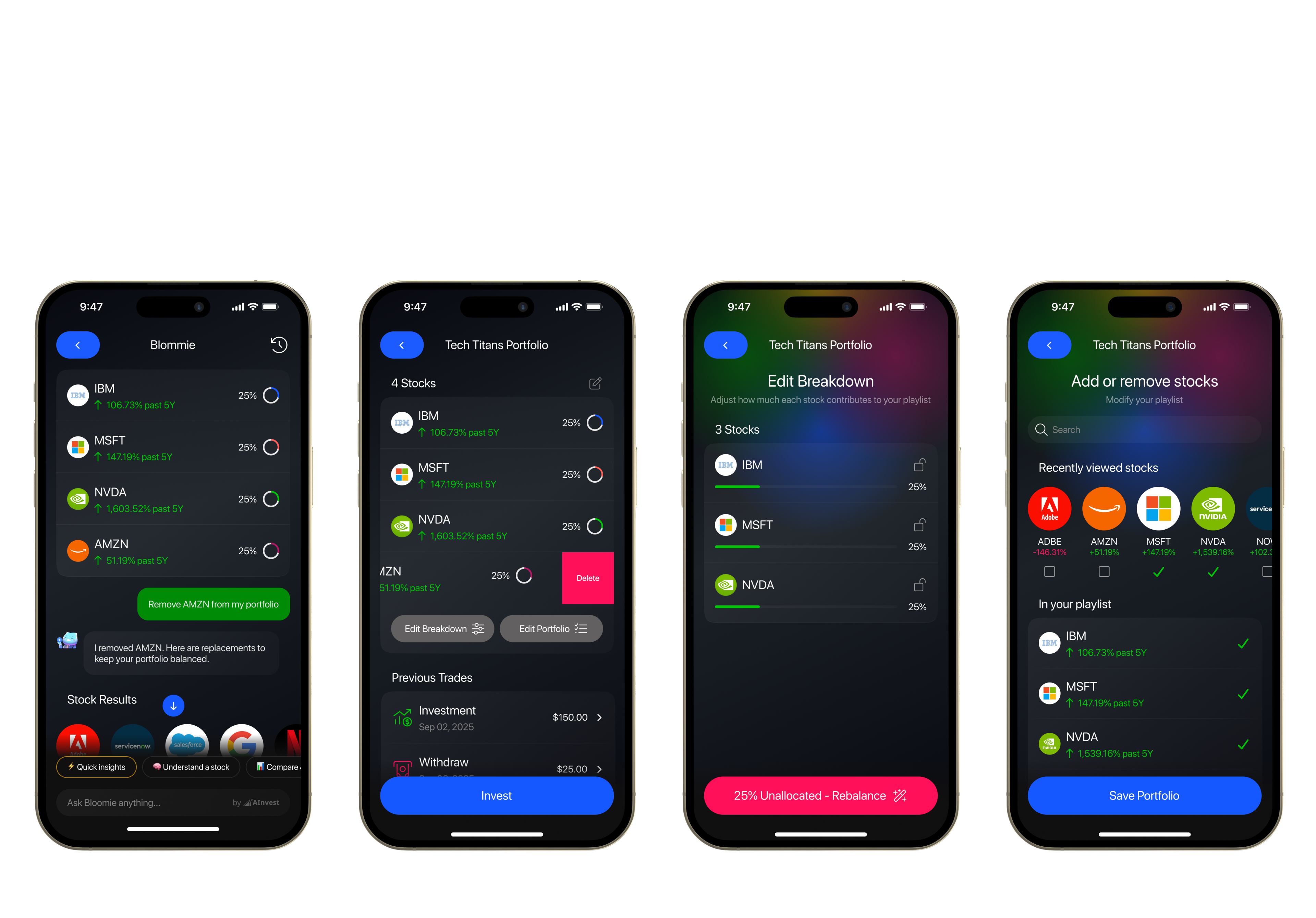
From Solo Portfolios → Shared Discovery
After launch, the engineers noticed that Bloomie portfolios weren’t staying individual. Users were already sharing ideas with friends and family, often by sending screenshots or lists of tickers.
Once those conversations left the product, portfolios lost structure. It became harder for others to understand what the portfolio actually represented or engage with it meaningfully.
I introduced a way to share portfolios that kept the experience grounded in Bloom. This allowed ideas to travel between people while preserving clarity and intent, turning individual research into something others could explore and act on as well.
.png)
Proposal
How Bloomie Evolved After Launch


Impact After Launch
11K+
Portfolios Created
~32%
Funded After Creation
$418K+
Investment Activity Enabled

.png)
.png)